Simplifying a mobility ecosystem used across Spain and Portugal
Transforming Telpark from a parking app into a mobility platform by simplifying a critical daily task for millions of users while enabling future product growth.
Users
App store rating
Reviews analysed
Historical analytics
The challenge
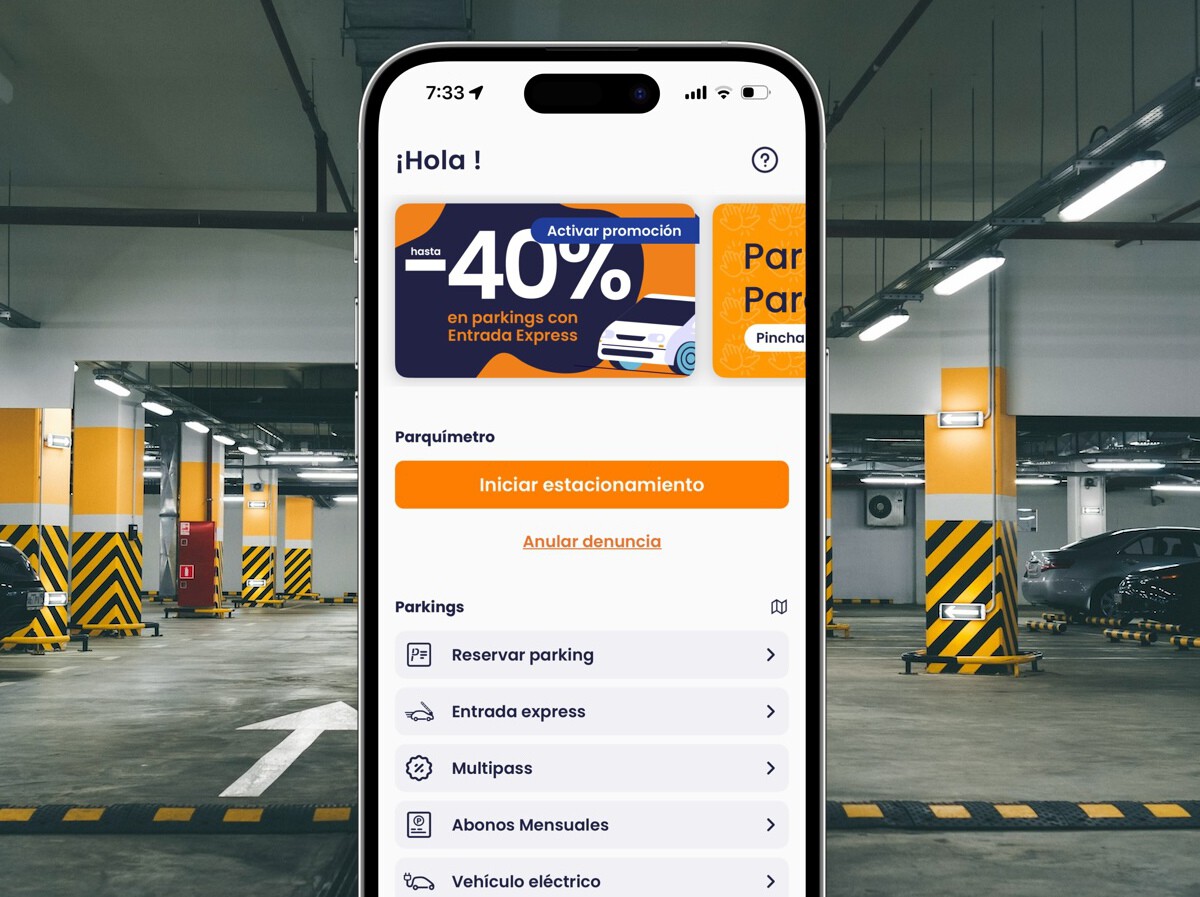
Telpark had grown into one of the largest mobility platforms in Spain and Portugal, serving millions of users every day. What began as a focused parking app had steadily expanded into a broader ecosystem of mobility services, payments and urban infrastructure.
As the platform grew, so did its complexity. Each new service added another layer to the experience, and the simple act people came to perform — start parking quickly — became harder to reach amid an expanding portfolio of features.
The tension was clear. Users wanted to start parking in seconds, while the business needed the platform to scale into new mobility services. The challenge was holding both truths at once.
Understanding the problem
We approached the problem by triangulating multiple sources of evidence rather than relying on any single signal. Behavioural analytics, app store feedback, funnel data, competitive analysis and stakeholder input were combined to build a complete and reliable picture of where users struggled and why.
Stakeholder interviews
Competitors analysed
Users tested
Research methods
What we learned
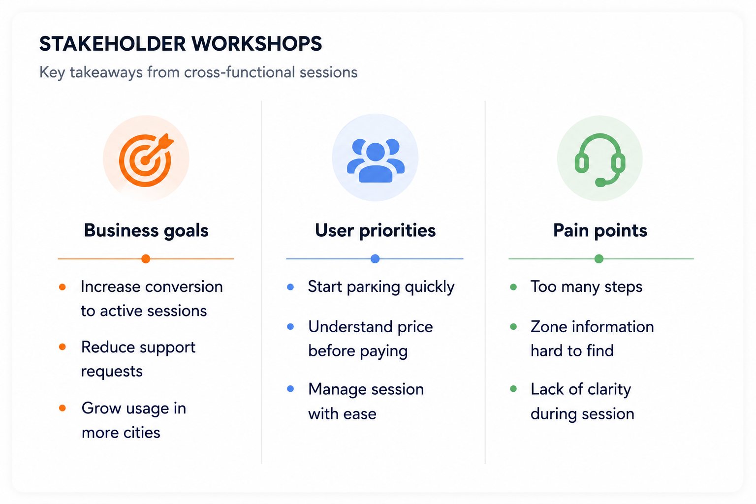
Users came to park, not browse services
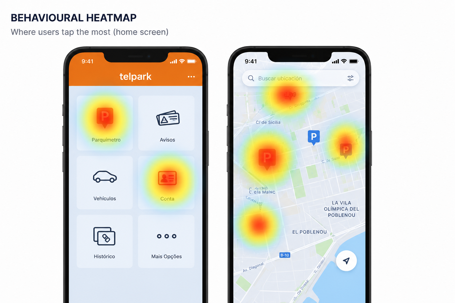
Zone information created unnecessary friction
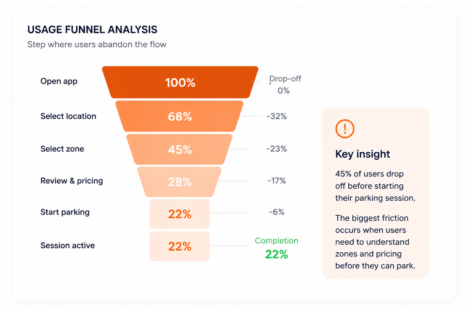
Navigation complexity had increased over time
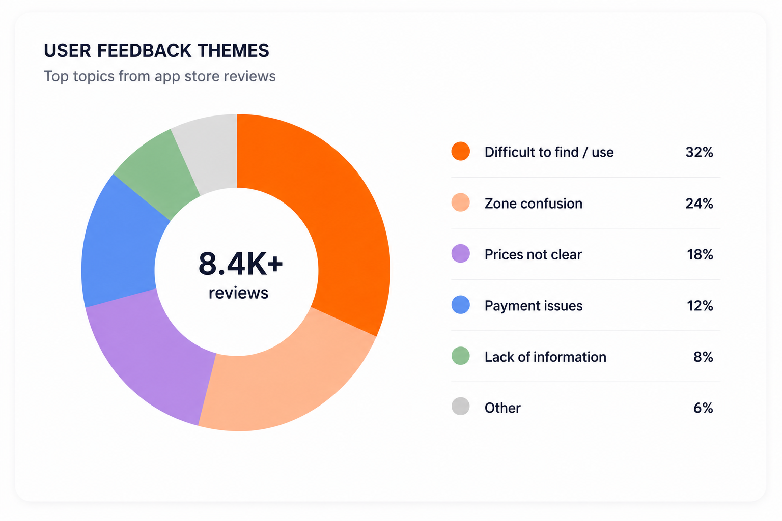
Business and user priorities were diverging
Strategic opportunities
Research findings translated directly into product opportunities — the bridge between understanding the problem and shaping a direction.
Make parking the primary experience
Increase pricing transparency
Reduce navigation complexity
Build a scalable foundation
Defining the product direction
With opportunities defined, the next step was deciding what to optimise for. These decisions explain why the product moved in the direction it did — not how individual screens changed.
Prioritise user intent over organisational structure
We designed around what users came to do, not around how the business or platform was organised internally.
Design around parking as the primary journey
Parking was the task millions of people performed every day. Every other service had to support it rather than compete with it.
Simplify before expanding
Reducing complexity in the core journey took priority over introducing new functionality, creating clarity the platform could build on.
Create room for future growth
Decisions were made with platform scalability in mind, so new mobility services could be introduced without rebuilding the experience.
Simplifying the architecture
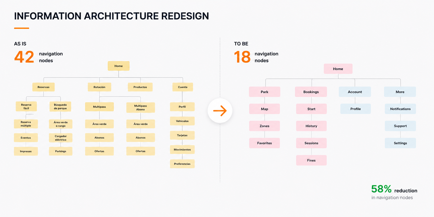
Navigation nodes
Reduction in complexity
A full navigation audit mapped every node in the application and revealed how complexity had accumulated as services were added over time. Many paths overlapped, competed for attention or buried the core parking task beneath secondary features.
We restructured the architecture around user goals rather than internal organisation, collapsing 42 navigation nodes down to 18. The result was clearer discoverability, a more direct path to parking and a scalable structure that could absorb future mobility services without reintroducing complexity.
This was a product architecture transformation, not a navigation redesign — the foundation everything else depended on.
Reimagining the parking experience
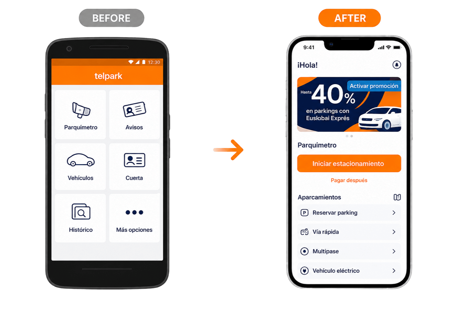
Strategic decisions translated into tangible experience changes, each one reinforcing parking as the primary journey.
Parking becomes the primary action
Moving towards a map-first experience
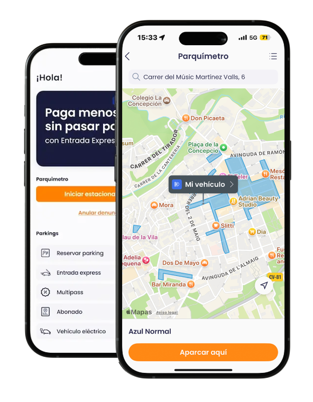
Improving pricing clarity

Simplifying session management

Validating the solution
Users tested
Scenarios validated
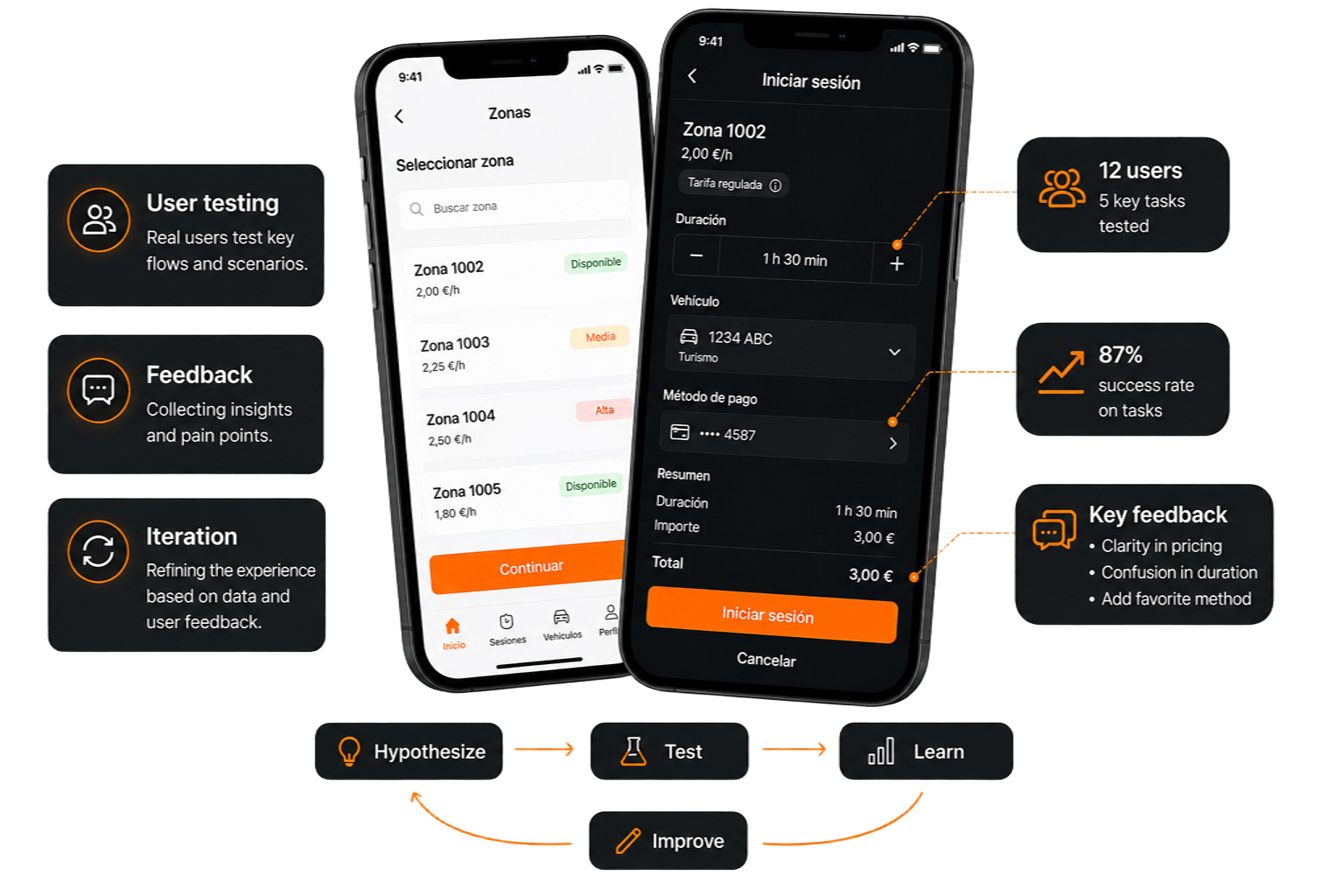
Iteration cycles
Feedback loops
Results and impact
Faster task completion
Users completed parking sessions faster and with greater confidence.
Reduction in support requests
Improved clarity reduced confusion around parking flows and violations.
Users reached
Monthly user growth
The redesign supported continued platform growth while creating a scalable foundation for future mobility services.
Reflection
Users care about accomplishing goals, not platform complexity.
Simplification can create more value than feature expansion.
A scalable architecture enables sustainable product growth.